Digipack Research
 I have looked at three different digipacks from the 'Foo Fighters', 'Oasis' and 'The Naked and Famous'. They all contain similar conventions to the genre of music. The 'Foo Fighters' album cover seen on the left, uses highly abstract objects that wouldn't necessarily relate directly to the audience, it portrays more of an entropic feeling. Little anchorage is used to explain why these pictures were chosen which again adds to the entropic features. Also the background is just a plain colour either white of dark brown. One feature that runs throughout all three and is usually seen twice on the digipack, once on the back and once on the inside left, is the barcode and copyright details. This is something that I must include in my digipack, this is one feature that runs through all genres of music.
With the 'Oasis' digipack the use of a fish-eye lens on the camera works well, as it is the same size as the CD contained and relates the two well. This is something I might also use in my project. Another feature that runs throughout is that none of these digipacks promote the start image of the band, only the 'Oasis' has a small picture of the band. This connotes that maybe the audience is expected to already know who the band are and what their star persona portrays. Use of colour is not one of the main conventions in the first two digipacks, however the 'Naked and Famous' digipack, seen below challenges those conventions seen above.
The outer ring uses two images that look to be at the same setting using the same angle and positioning for the photograph, but a completely different mise en scene because one is completely covered in snow. Then completely contrasting that there is the use of an inner circle, also seen in the 'Oasis' digipack. But this one contains bright colours with a kind of pop art feel to them. This album cover has many conventions of the other two but also challenges them too.
Overall I like the use of the circular theme and I like the effect of a fish-eye lens, I also like the way the last digipack challenges the original conventions with the use of bright colours. All three use a very simplistic layout they're not cluttered with lots of information, just the band name and album title. Equally the back of the cover is the same with just the list of the songs, without numbers by the side of them, copyright information and a barcode. Also the very minimal use of the star persona runs through all three. These are all conventions I believe work very well making the the CD as a whole more interesting and intriguing for the target audience.
Advert Research
 Here is a previous advert from the band that I am using in my music video. Straight away, it clearly shows the star persona of the band, and each member showcasing they're individual instruments and styles in the four images across the top. This is something I must continue for my project, consistently portraying the distinct image of the band so they are clearly noticeable for their regular audience. The advert is sized A4, the bands name 'This Wicked Tongue' is written in the same font that is used on their other adverts and media texts. The advert is overall rather redundant it contains the album name, the release date and other information about the band's social networking sites. One feature that is really useful is the QR code, that can be scanned by any smart phone and sends you straight to their website. Also all the links to their YouTube, Twitter and Facebook are shown, this is something I believe I should also include in my magazine. The advertising of the album is just a small part of the advert because as all artists are realising now is that the main income for artists is moving away from album sales and more on to tours and live gigs, mainly because of piracy and illegal downloading.
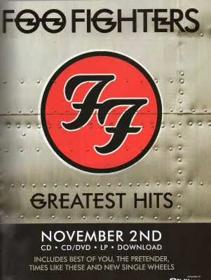
This 'Foo Fighters' advert is also A4 sized and ultimately very redundant. The use of the bands own logo (seen below) is part of the bands image and a noticeable feature for all most people who know about the band.

This advert is even more redundant than the first, the only information seen on this advert is the band name, album name, release date and a couple of the most well known songs, although that isn't much it is all that is needed for a well know, popular band. As it is advertising their 'Greatest Hits' album it is more aimed at existing fans and is less about selling the band as a whole.
Overall these two adverts have very similar qualities but also challenge the conventions in different ways. From this research I can clearly see that, how popular the band is and the money and backing they have behind them completely changes the advert. For smaller, up and coming bands it is more about getting the band name out there and not only advertising the album but the band as well. Whereas for the bigger bands and artists it is about reaching out to their existing fans and less about advertising who the band are and where to find them. So I know for my advert I will have to show the star persona and advertise the band as a whole and less about the album. However the redundant feel is used throughout, no matter how big the band is, so that is something I must also continue through to my print work.


No comments:
Post a Comment